Animation blob
CSS Animation
index.html
Login to Copy
<!DOCTYPE html>
<html lang="en">
<head>
<meta charset="UTF-8">
<meta name="viewport" content="width=device-width, initial-scale=1.0">
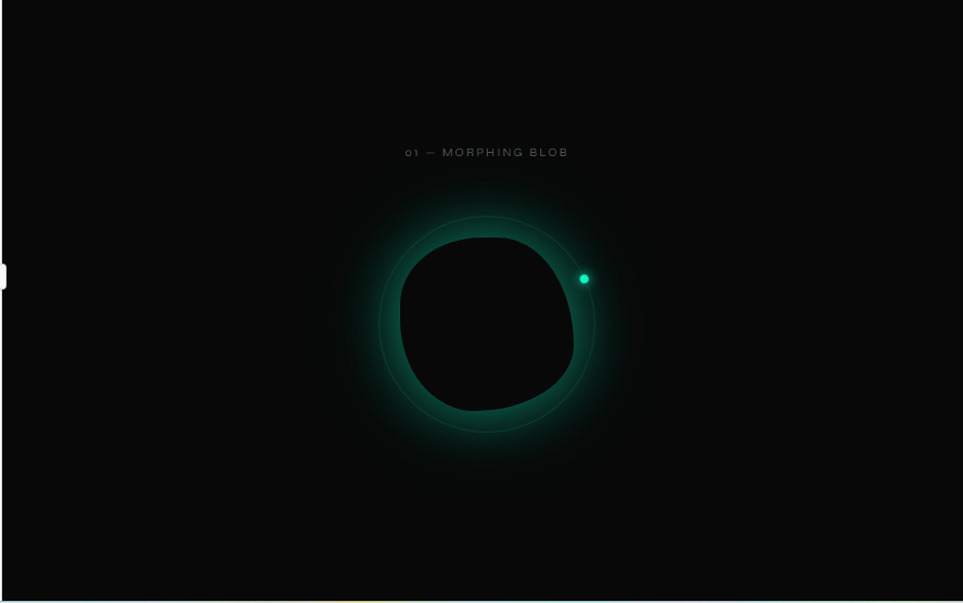
<title>Animation 01 — Morphing Blob</title>
<style>
@import url('https://fonts.googleapis.com/css2?family=Syne:wght@400;700&family=DM+Mono:wght@400;500&display=swap');
*, *::before, *::after { box-sizing: border-box; margin: 0; padding: 0; }
body {
background: #080808;
color: #e8e8e8;
font-family: 'DM Mono', monospace;
display: flex;
flex-direction: column;
align-items: center;
justify-content: center;
min-height: 100vh;
}
.label {
font-family: 'Syne', sans-serif;
font-size: 11px;
letter-spacing: 0.2em;
text-transform: uppercase;
color: #555;
margin-bottom: 32px;
text-align: center;
}
.blob-wrapper {
width: 240px;
height: 240px;
display: flex;
align-items: center;
justify-content: center;
position: relative;
}
.blob {
width: 160px;
height: 160px;
background: radial-gradient(135deg, #0ff5c1 0%, #0a9e7a 40%, #0d5c50 100%);
border-radius: 60% 40% 30% 70% / 60% 30% 70% 40%;
animation: morph 7s ease-in-out infinite, glow-blob 7s ease-in-out infinite;
}
@keyframes morph {
0% { border-radius: 60% 40% 30% 70% / 60% 30% 70% 40%; }
20% { border-radius: 30% 60% 70% 40% / 50% 60% 30% 60%; }
40% { border-radius: 70% 30% 50% 50% / 30% 70% 50% 50%; }
60% { border-radius: 50% 50% 20% 80% / 70% 20% 80% 30%; }
80% { border-radius: 40% 60% 60% 40% / 40% 50% 60% 60%; }
100% { border-radius: 60% 40% 30% 70% / 60% 30% 70% 40%; }
}
@keyframes glow-blob {
0%, 100% { box-shadow: 0 0 40px #0ff5c155, 0 0 80px #0ff5c122; }
50% { box-shadow: 0 0 60px #0ff5c188, 0 0 120px #0ff5c133; }
}
.blob-ring {
position: absolute;
width: 200px;
height: 200px;
border: 1px solid #0ff5c120;
border-radius: 50%;
animation: spin-ring 12s linear infinite;
}
.blob-ring::before {
content: '';
position: absolute;
top: -4px; left: 50%;
width: 8px; height: 8px;
background: #0ff5c1;
border-radius: 50%;
transform: translateX(-50%);
box-shadow: 0 0 10px #0ff5c1;
}
@keyframes spin-ring {
from { transform: rotate(0deg); }
to { transform: rotate(360deg); }
}
</style>
</head>
<body>
<p class="label">01 — Morphing Blob</p>
<div class="blob-wrapper">
<div class="blob-ring"></div>
<div class="blob"></div>
</div>
</body>
</html>